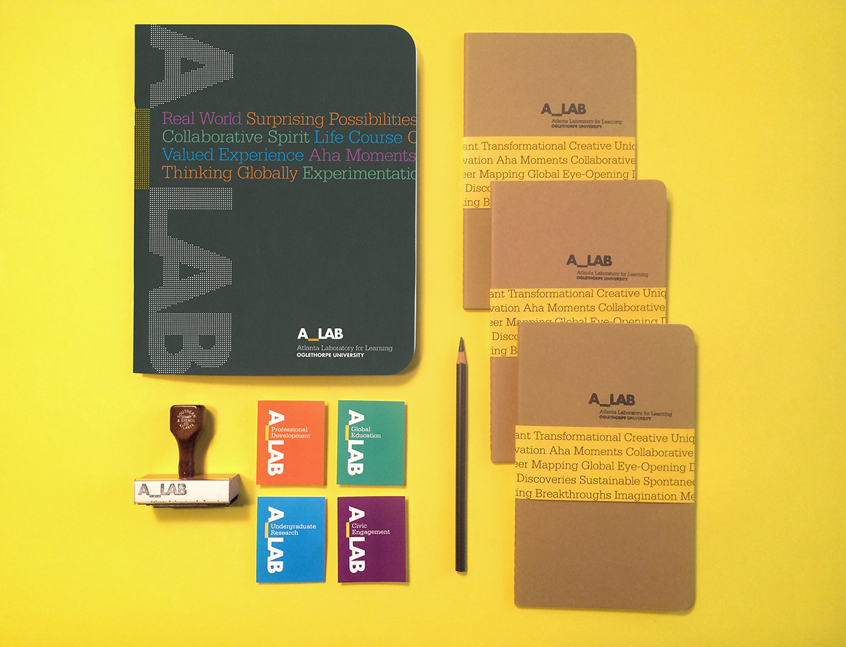
Oglethorpe A_LAB identity, 2014
Oglethorpe University created an experiential counterpart to their liberal arts curriculum. The divisions for Civic Engagement, Global Education, Professional Development, and Undergraduate Research and Scholarship combined to form the A_LAB, short for Atlanta Laboratory for Learning.
The A_LAB identity activates the simple wordmark set in Futura Bold by rotating it and dynamically filling in the underscore.
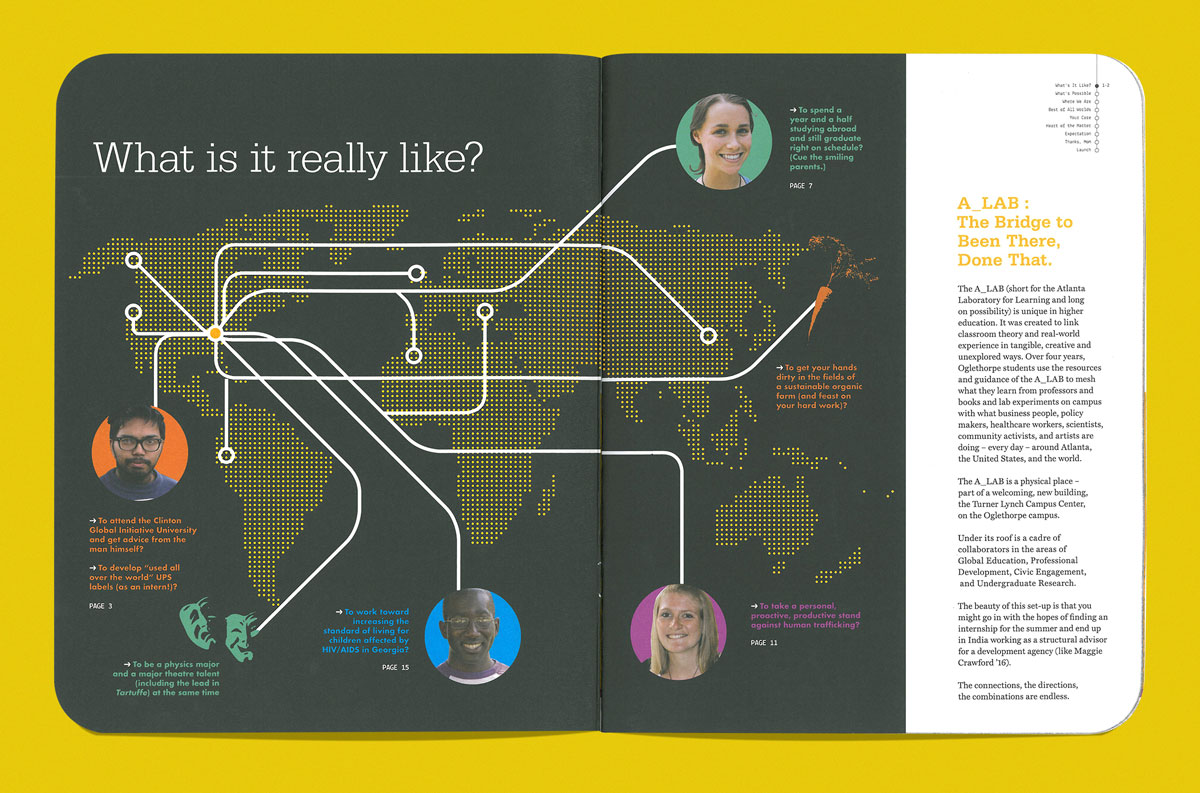
Oglethorpe A_LAB Viewbook, 2014
The literary idea of in media res informs the use of graphics and photography. When viewers experience a piece of media from A_LAB, they are dropped into the middle of the narrative to witness a flurry of activities in service, study abroad, career exploration, and research. Graphics allude to transit stations, maps, display boards, and urban wayfinding systems.
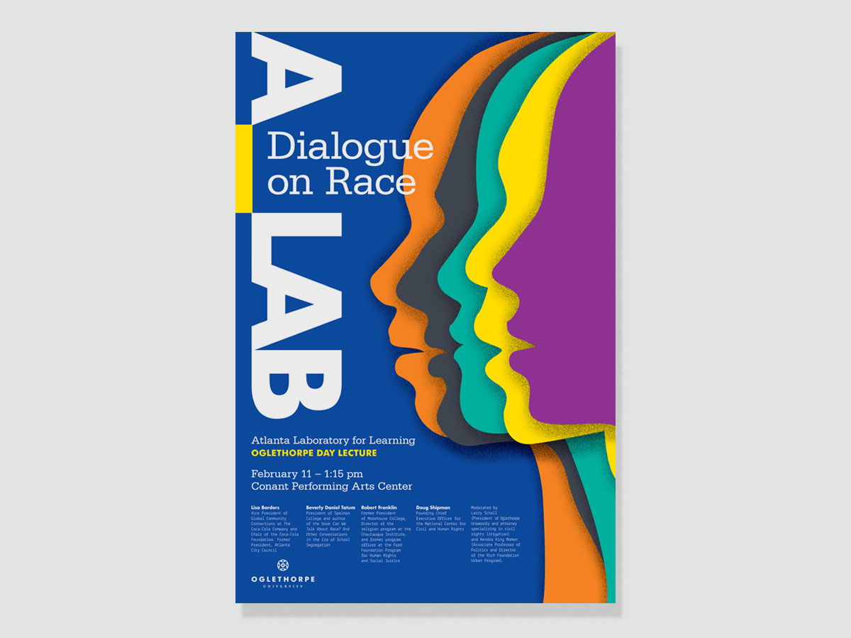
Oglethorpe A_LAB Symposium Poster, 2015
Layered silhouettes of varying form and color symbolize the diversity of speakers taking part in a discussion about race at Oglethorpe University’s A_LAB.
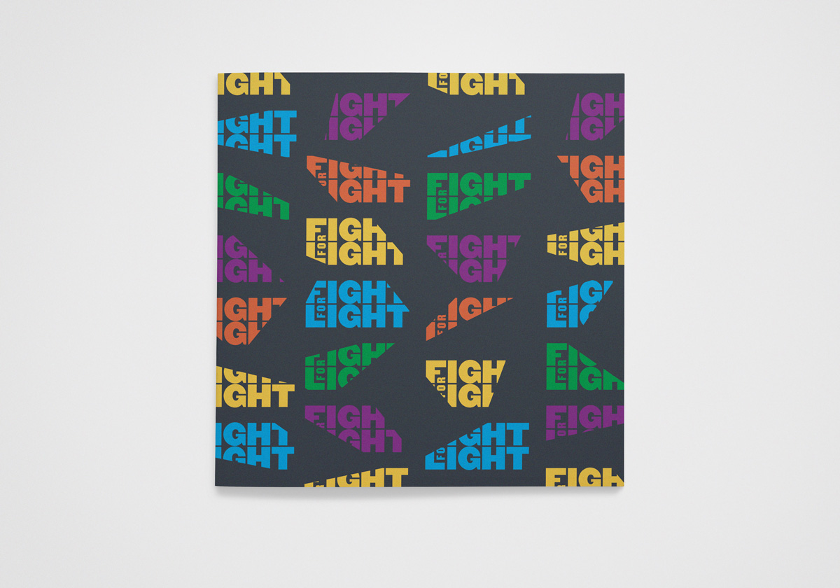
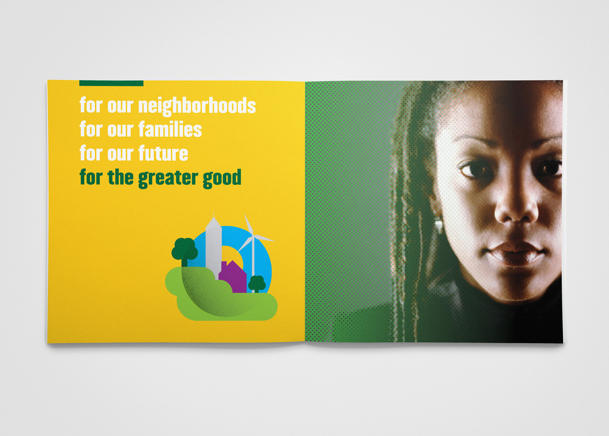
Fight for Light identity and program guide, 2013
Fight For Light is a non‑profit social enterprise dedicated to transforming Historically Black Colleges and Universities (HBCUs) into hubs for sustainability and social innovation. The brand identity is based on the idea of transformative illumination—building awareness of sustainability issues and the possibilities that the green economy brings to minority communities. This cover shows the flexible logo, which alludes to moving beams of light.
Fight for Light program guide, 2013
Bold color, type, and illustration build a visual narrative for Fight for Light. 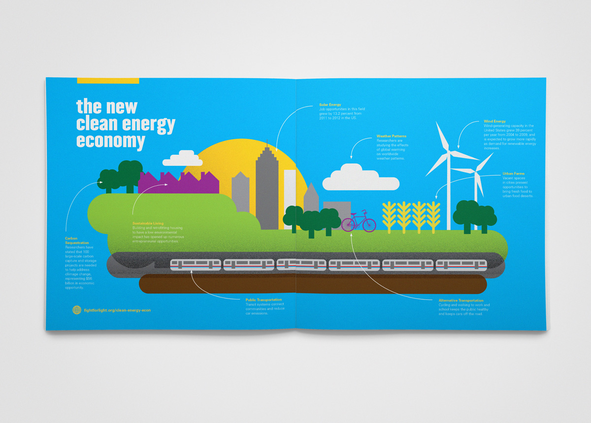
Fight for Light infographic, 2013
Simple infographic illustrations explain opportunities for minorities and underrepresented communities to participate in the clean energy economy.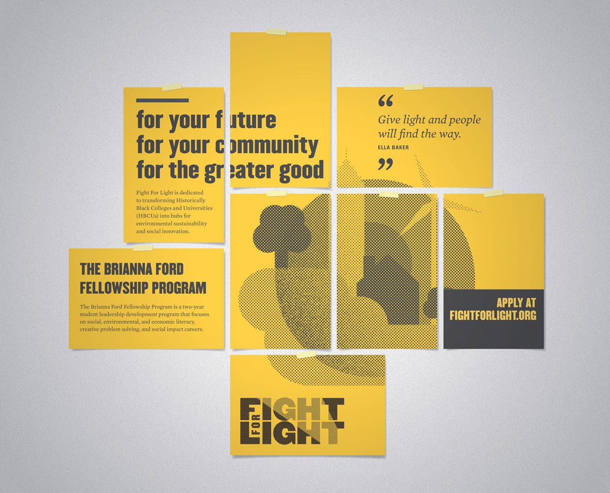
Fight for Light posters, 2013
The on‑campus poster system is modular, allowing for flexible and dynamic compositions.Fight for Light Design Process, 2013-2014
This video is a documentation of snippets of research,
sketches, and experimentation for the Fight for Light
project. Fight for Light envisions itself as a contemporary
continuation of the civil rights movement of the 50s and
60s, harnessing the same energy toward minority
participation in environmental issues. Fight for Light
launched on the historic Atlanta University Center campus, a
traditional center of civil rights activism. As shown in the
video, imagery, iconography, and typography from the civil
rights era subtly influence the design for this project.
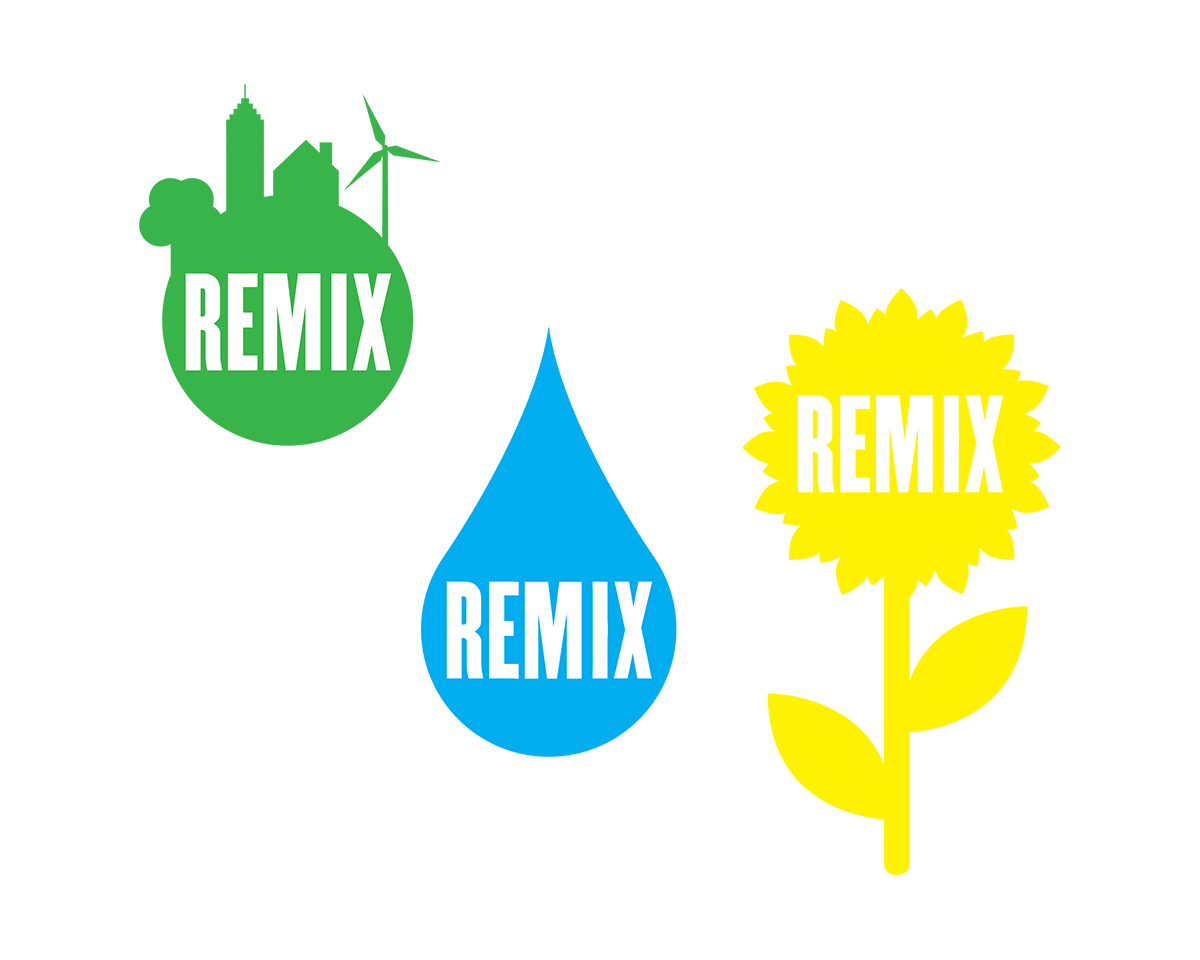
Remix identity, 2014
An offshoot of Fight for Light, Remix “harnesses the innate hustle, skill, and creativity of communities not typically targeted for innovation and catalyzes the power of communities to determine their own future.” The organization explores the African American cultural legacy and its connection to the innovation economy. The identity for Remix is a flexible system that shape-shifts and rotates. The type is disrupted, spinning to create countless variations.
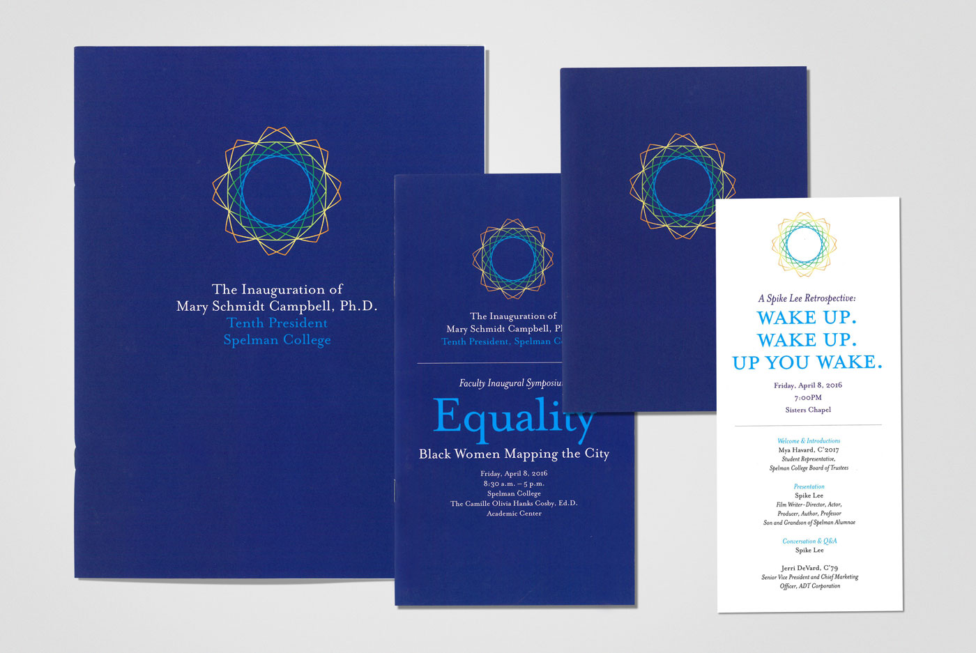
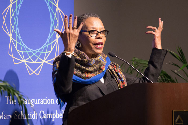
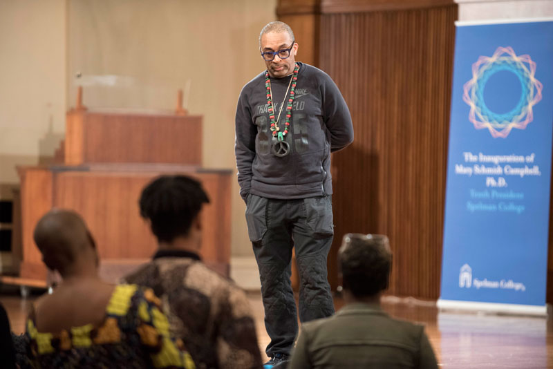
Spelman College Inauguration, 2016
Identity design and suite of printed materials for the inauguration of Mary Schmidt Campbell, Ph.D., tenth president of Spelman College.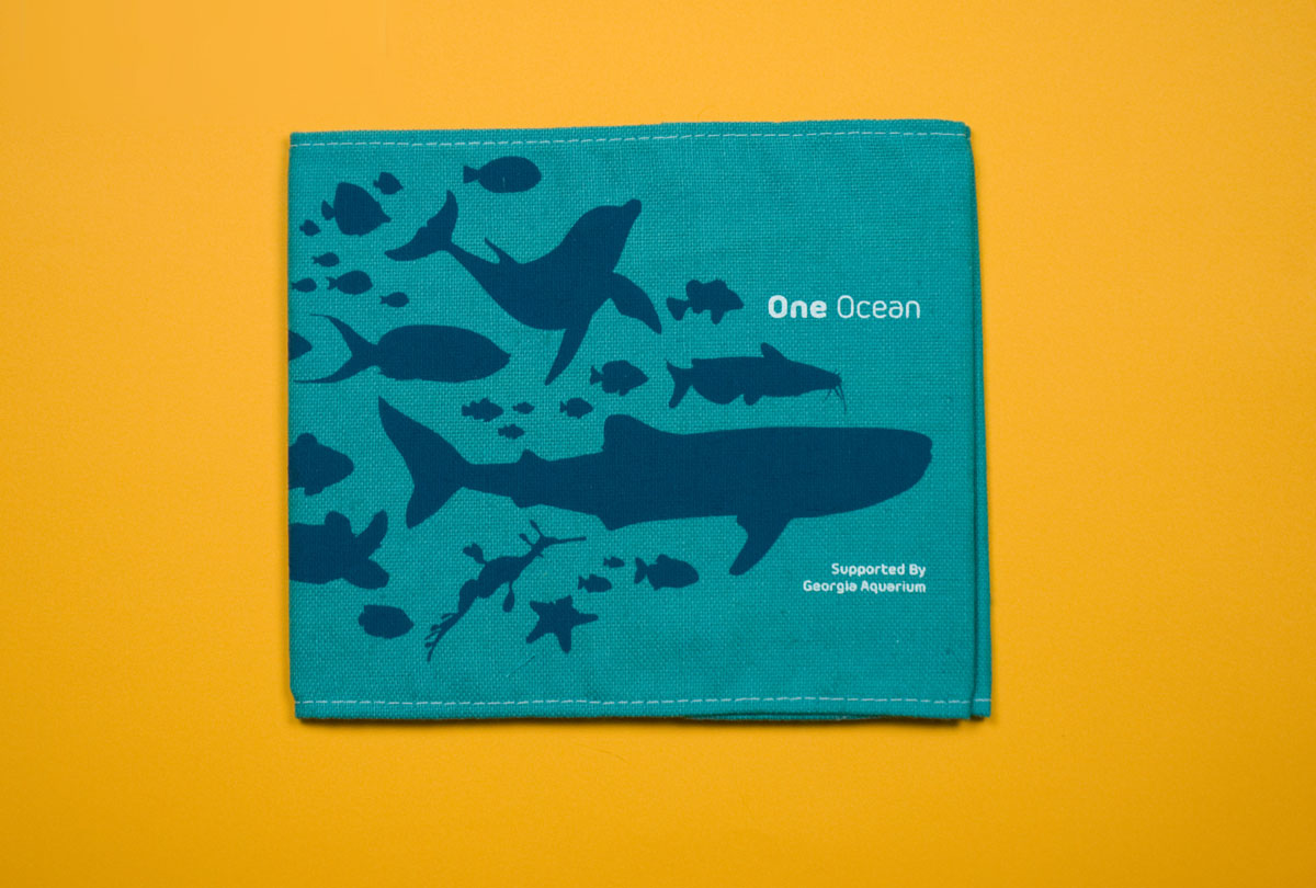
Georgia Aquarium One Ocean Book, 2014
Many people view the Georgia Aquarium primarily as an entertainment attraction. This book showcases Georgia Aquarium’s equally‑important efforts in research, conservation, and education. Aiming to engage potential corporate and individual donors, the book focuses on the connection between the ocean and human well‑being. I wanted the piece to have a certain level of tactility, so I opted to wrap the book in a silkscreened canvas case.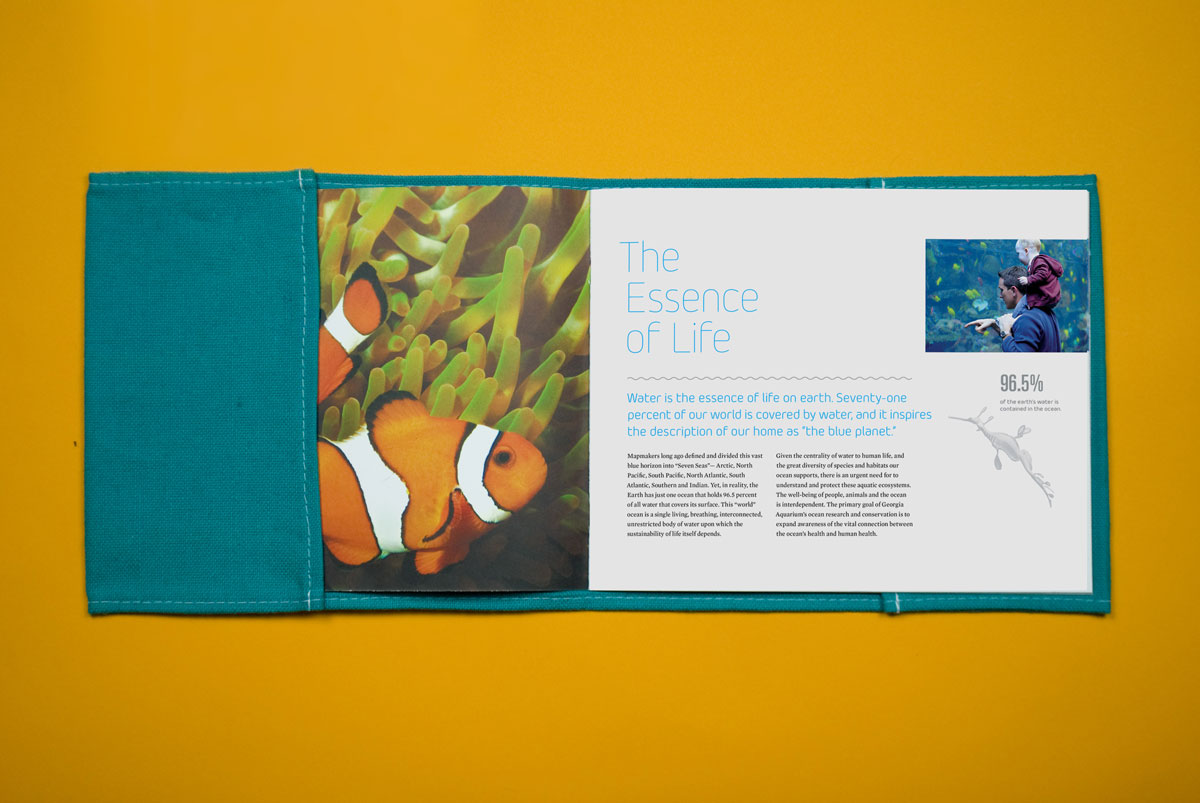
Georgia Aquarium One Ocean Book, 2014
The book itself was printed in vibrant UV inks on uncoated stock to show off the rich colors of the aquatic photography. Animals from the cover make their way inside to accompany statistics and other notes in the margins.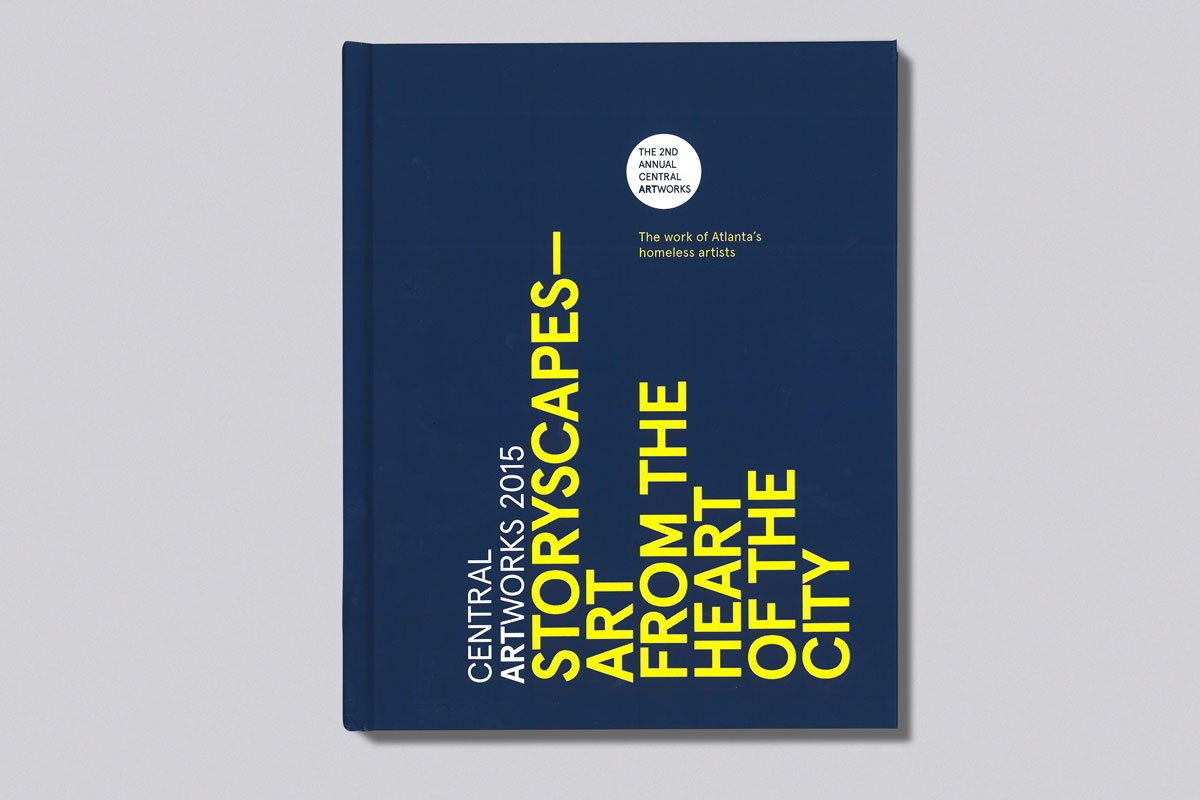
Storyscapes Catalog, 2015
Organized by the Central Outreach and Advocacy Center in Atlanta, Storyscapes: Art from the
Heart of the City was an exhibition featuring work from artists experiencing homelessness in Atlanta. The exhibition catalog showcases artwork along with profiles of several artists.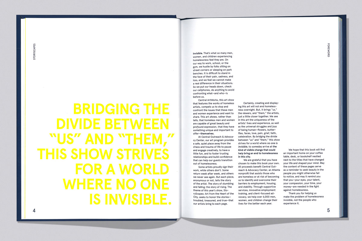
Storyscapes Catalog, 2015
Bottom-aligned type alludes to the tall buildings of the downtown Atlanta environment, the context for the daily lives of the artists. The irony of this context is that many of these massive buildings sit empty at night as people set up shelter outside their perimeters.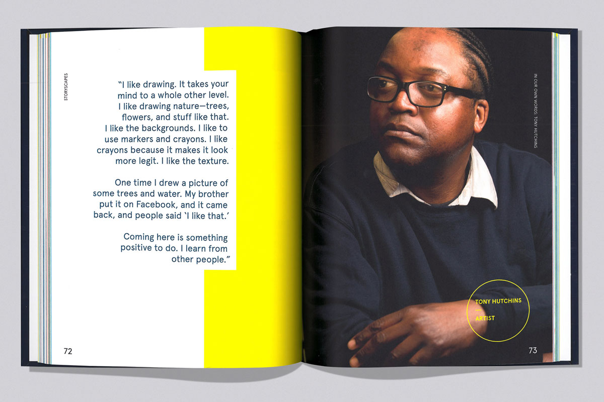
Storyscapes Catalog, 2015
As part of the exhibition and catalog, I interviewed seven of the artists about their work while art directing a photo shoot with Atlanta photographer Billy Howard. These first-person, full-spread profiles give rhythm to the book.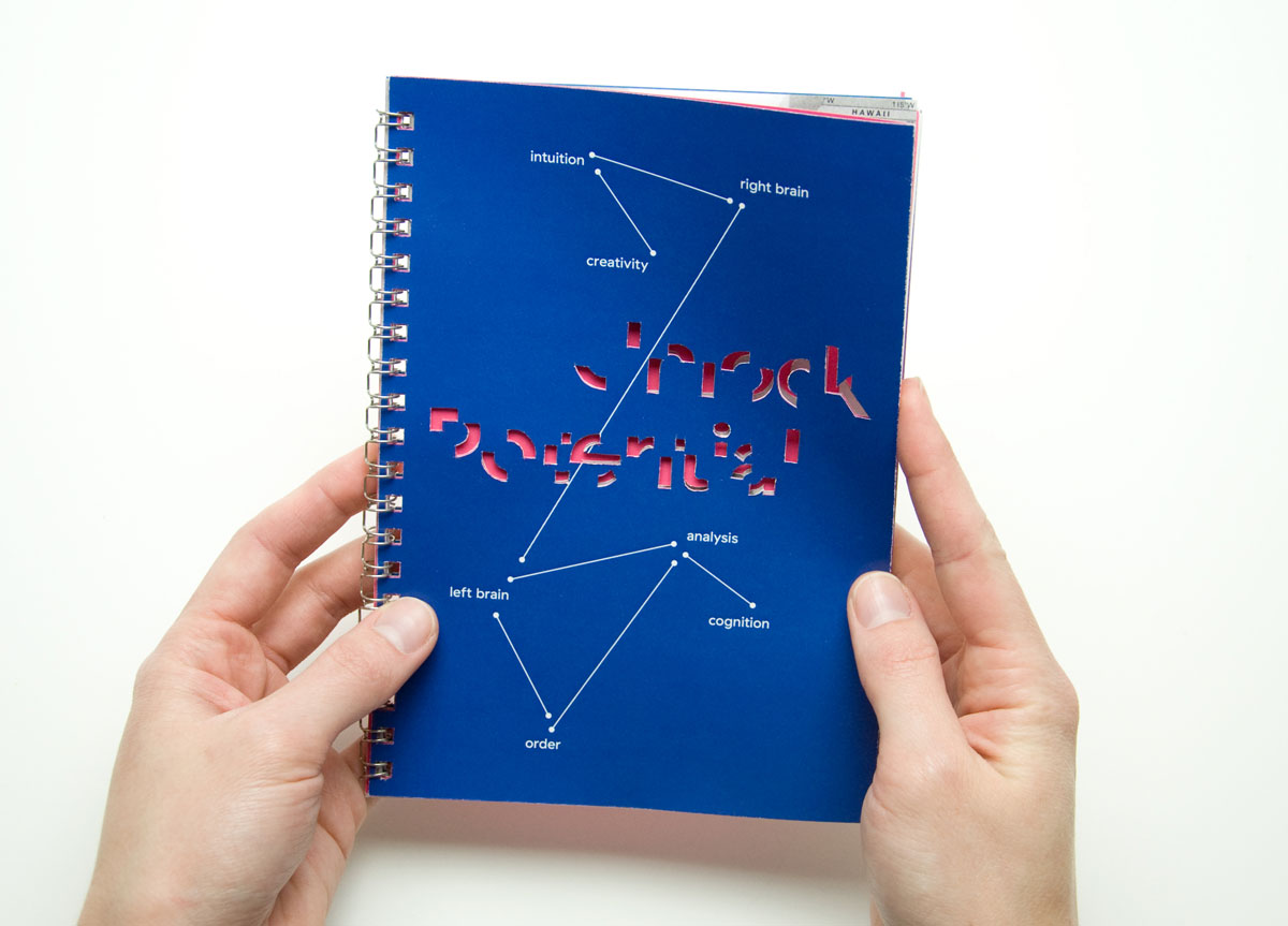
Swift School teaching philosophy book, 2015
This book introduces the teaching philosophy of the Swift School, a school in Atlanta devoted to teaching children with dyslexia. Word constellations allude to firing synapses, representing discoveries and connections forming in students’ brains as they work through the challenges of dyslexia in a holistic learning environment. Deconstructed, die-cut type on the cover alludes to the experience of reading with dyslexia.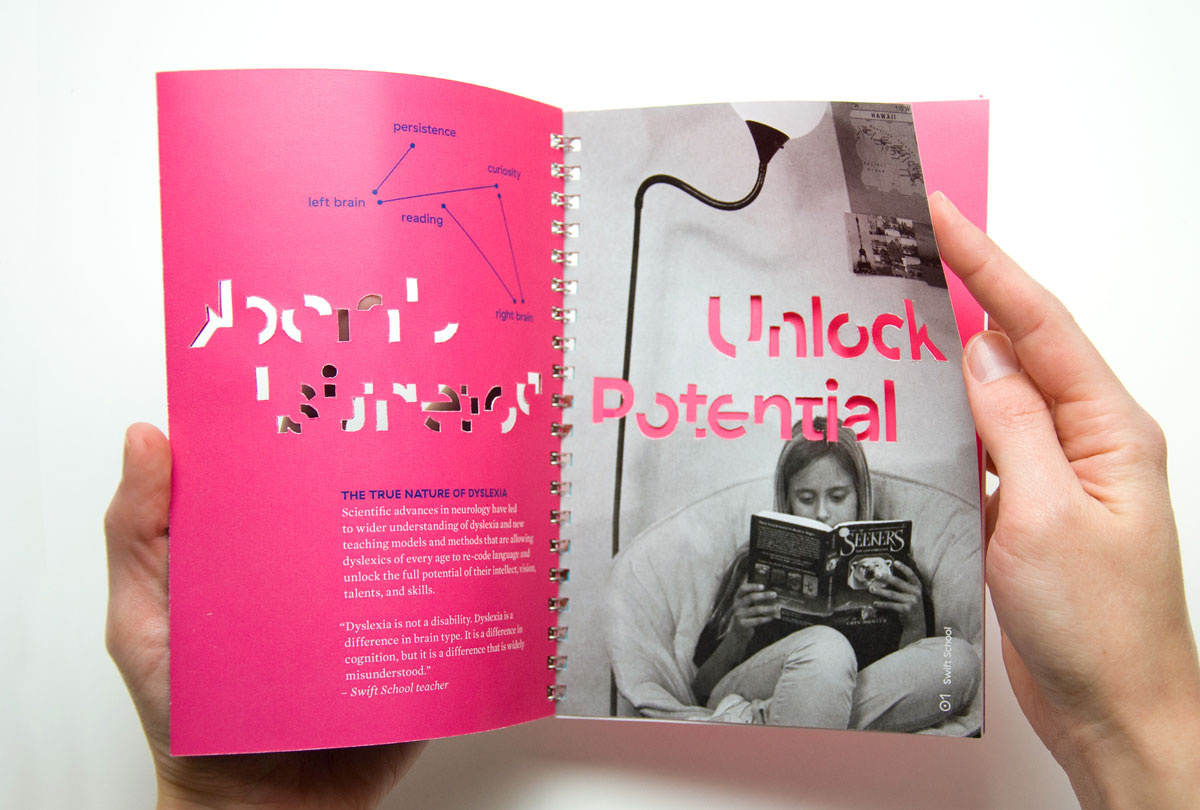
Swift School teaching philosophy book, 2015
The die-cut type is gradually fully revealed, mimicking the experience of overcoming dyslexia. The selection of quirky GT Haptik as the primary typeface supports research that persons with dyslexia have an easier time reading text set in typefaces that have considerable distinction and variation among the letterforms.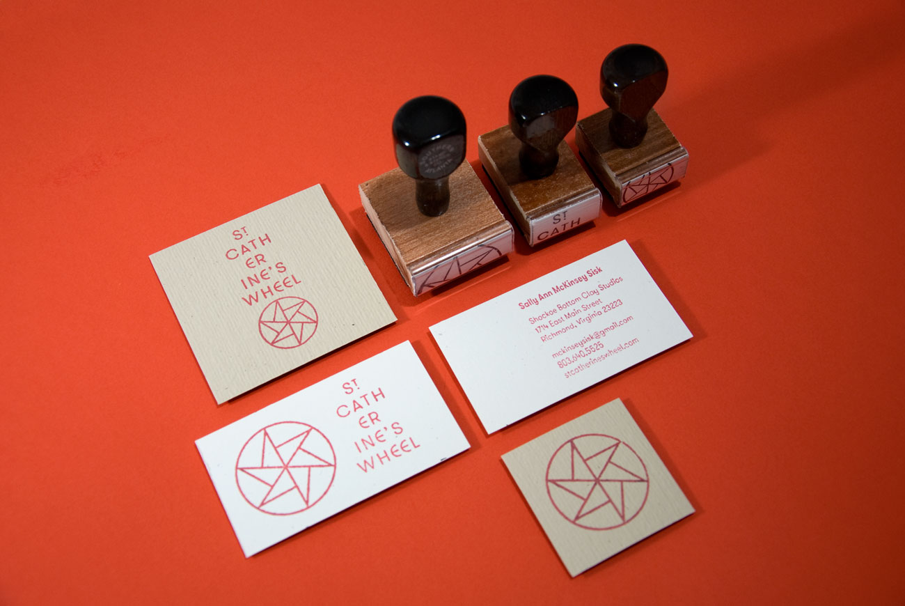
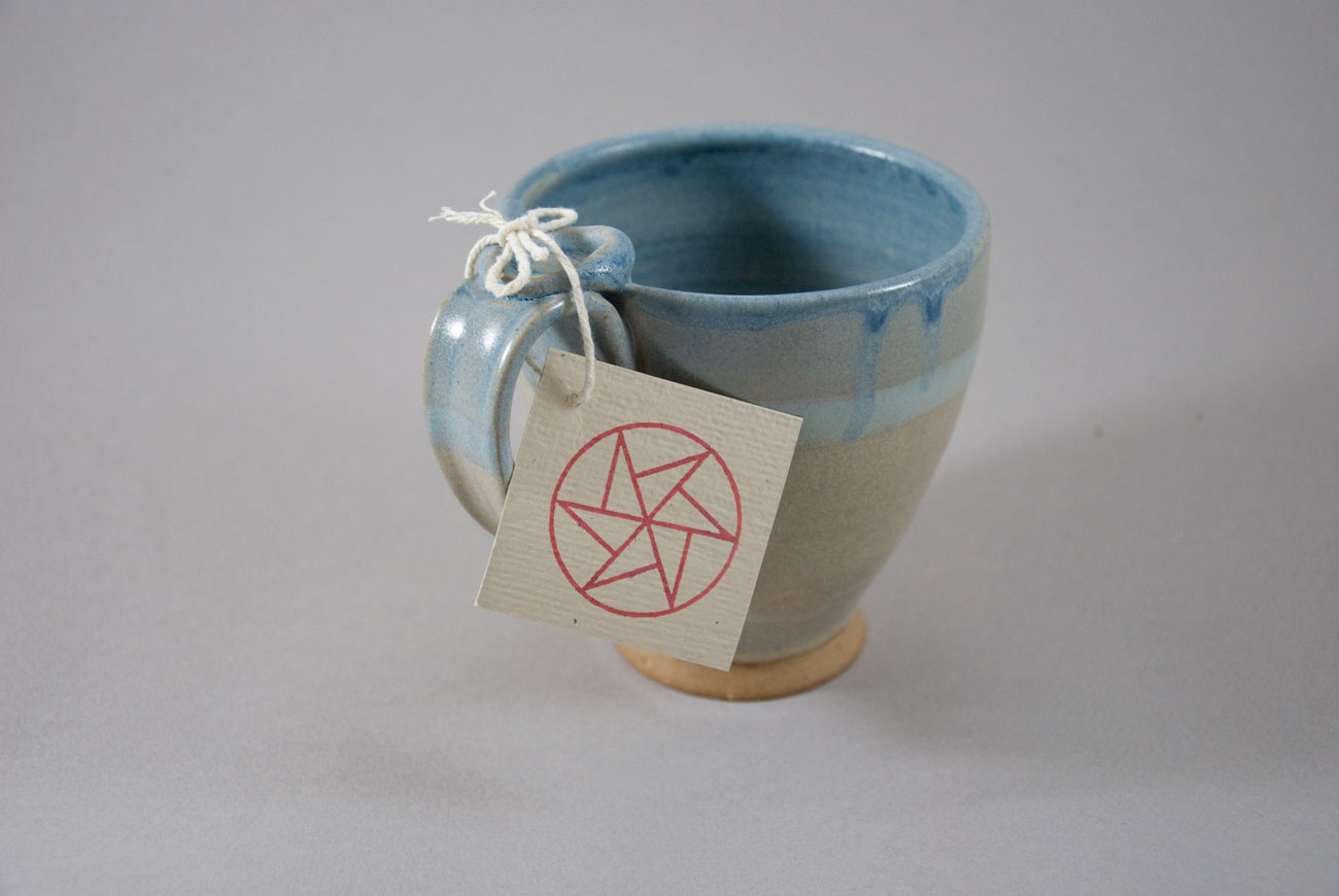
St. Catherine's Wheel identity, 2015
St. Catherine’s Wheel is a graphic design investigation into the ceramic work of Sally Ann McKinsey Sisk. St. Catherine is patron saint of wheel-throwing potters. The graphic for St.Catherine’s Wheel is a contemporary interpretation of the stacked vertical typography found on eastern orthodox icons. The mark is a reference to the pinwheel, a traditional symbol of St. Catherine.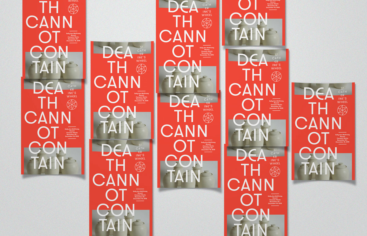
St. Catherine's Wheel posters, 2015
The poster system for St. Catherine’s Wheel uses stacked vertical typography, inspired by type found on eastern orthodox icons.St. Catherine's Wheel design process, 2015
An investigation into eastern orthodox iconography and typography yielded a design vocabulary for St. Catherine's Wheel, documented in this short video.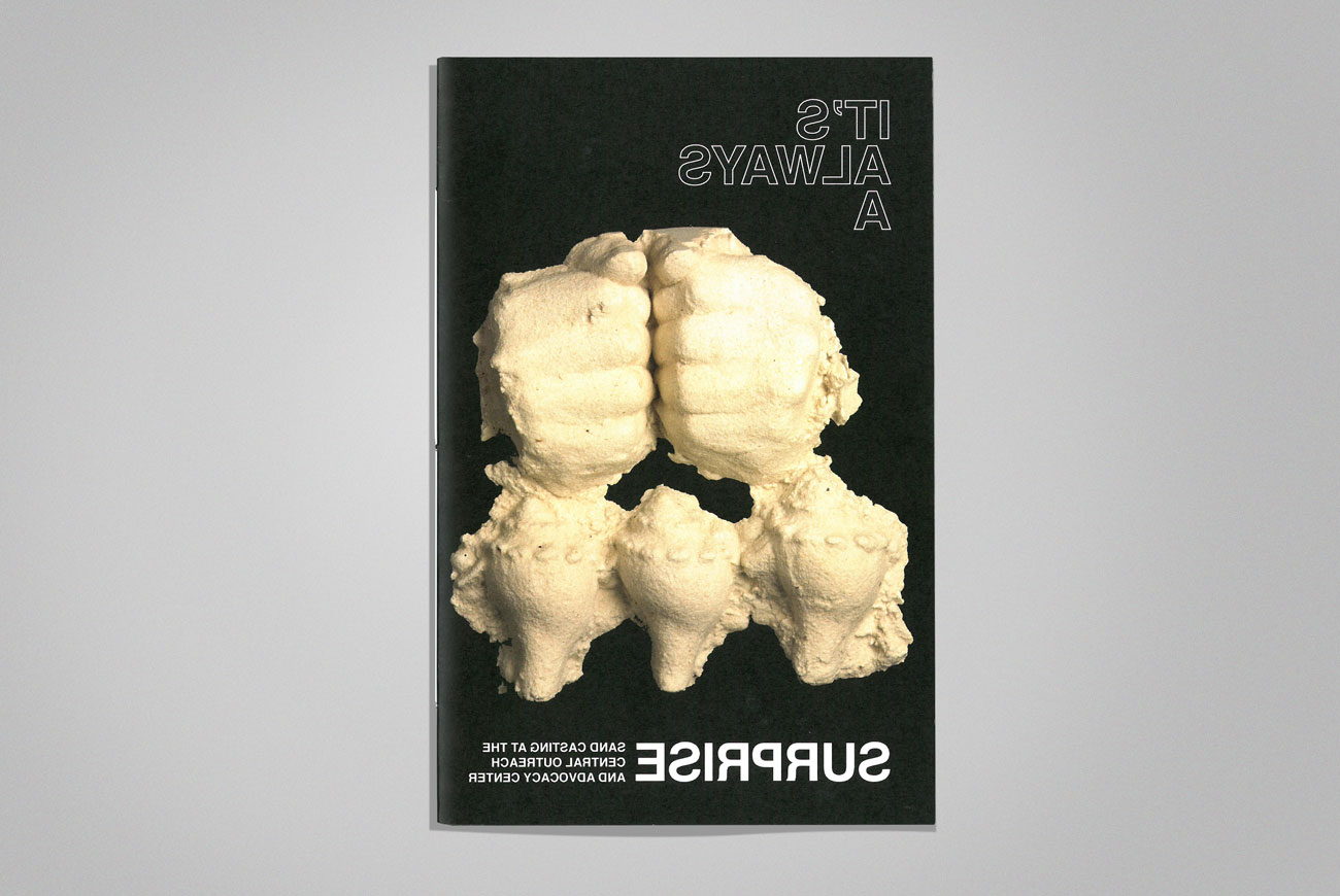
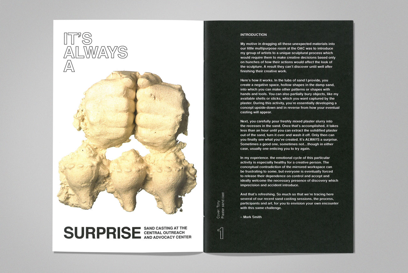
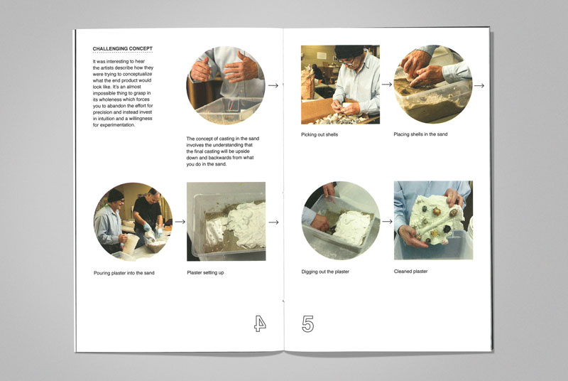
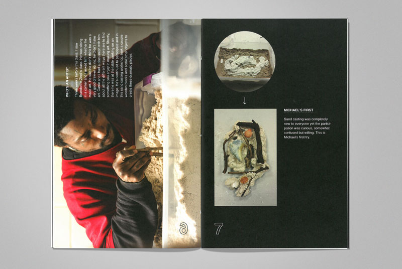
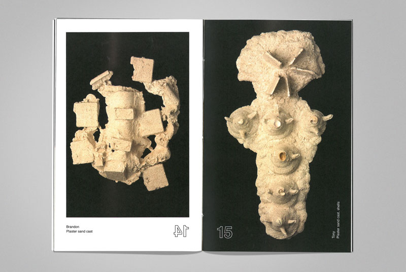
It's Always a Surprise, 2016
A documentation of the sand casting process at the Central Outreach and Advocacy Center, this hand-bound book was part of the exhibition catalog for a show featuring Atlanta artists experiencing homelessness.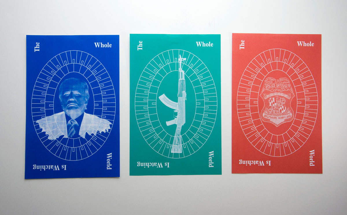
The Whole World, 2015
2015 was a turbulent year for the United States on a number of fronts. Frequent mass shootings, police brutality, and fractured politics have created a scary spectacle. These compositions layer images and type in response. A schematic drawing of a stadium represents the ways all of us watch, take part, defend, and criticize what we see and experience.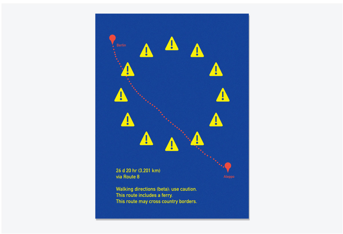
Use Caution, 2015
Google Maps’ walking directions from Aleppo to Berlin are dotted with warning signs, eerie metaphors for the harrowing stories coming from the region and literal proof of just how perilous the journey is for refugees fleeing Syria. This poster is a response to these revelations from Google Maps. Caution symbols stand in for the stars of the European Union flag, representing some of the many
barriers refugees face on their journey westward.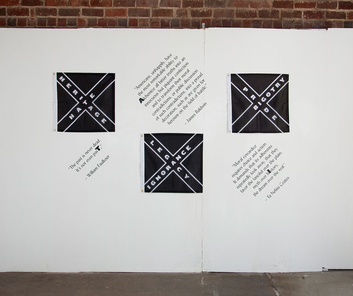
Past Presence, 2015
The Confederate flag commanded a prominent position on the state house grounds in South Carolina, my home state, until it was removed in July 2015, following the tragic murder of nine African Americans at Emanuel AME Church in Charleston. Impassioned proponents of the Confederate flag
have long argued it serves as a symbol of “heritage, not hate.” My work lifts up the absurdity of this myth, naming the history of this flag as one of hate, bigotry, and ignorance. 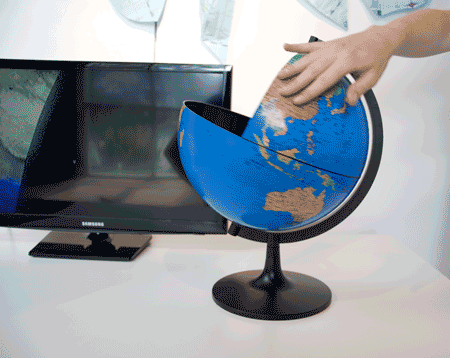
Edges, Gaps, Glitches, 2016
Edges, Gaps, Glitches began as an investigation into a technological curiosity. While browsing the globe through Google Maps, my WiFi signal suddenly gave out and a gaping hole was left out of the earth. No big deal right?—it’s just a glitch. I think it’s more compelling and deserves a closer look.I’ve always been curious about boundaries and borders. Lines on the map combine topography and natural formations with a complex history of migration, strife, war, and geopolitical maneuvering. Those lines often seem arbitrary and ill-conceived, as culture, language, and shared experiences spill over the boundaries. Where does one place end and another begin? Why was a huge chunk of the Global South left out in the Google glitch?
A primary concession in two-dimensional map-making is that it’s impossible to render a proportionally and spatially accurate depiction of the spherical earth on a flat plane. The problems and issues of map-making have been historically complicated by political hegemony. For example, in many two-dimensional map projections, land masses near the poles are exaggerated in size, making it seem as if Northern Europe and North America are much larger than they actually are. As a result, we get a distorted view of the world and the relationships between places. This is a flaw, a glitch. The flattened inflatable globe in my installation is an attempt to challenge our preconceptions for how a world map should look, creating alternate geographic relationships.
Visually, this piece is a juxtaposition of digital and organic, moving and static, dimensional and flat. The modified video of the Google glitch is situated with its three-dimensional inverse. What does a digital glitch look like in physical form? Technology is the new cartographer and borders are more fluid than ever. In politics, culture, and commerce, we are reimagining and questioning boundaries.